Case study 02 · Boston University
Connecting discovery, giving, and impact through AI.
A freelance project exploring how AI could connect an existing but fragmented university giving ecosystem into a more personal donor journey.
- Type
- Freelance project
- Role
- Product strategy, UX research, AI interaction design, prototyping
- Organization studied
- Boston University Alumni & Friends
- Status
- Concept prototype · donor testing planned
The opportunity
Major donors get a relationship. Annual donors mostly find their own way.
High-touch: major & principal donors
Individual attention from advancement staff: guidance before a gift, a relationship after it.
Self-serve: annual donors
Find a fund alone, give through a form, and rarely hear how that program is doing.
The constraint
Staff capacity: individual cultivation doesn't scale to every annual donor.
Exploratory conversations in the advancement sector, and feedback relayed from alumni and donors, pointed to the same few concerns. Advancement leadership has also expressed interest in exploring AI for annual giving and longer-term donor relationships.
- Finding relevant giving opportunities can be difficult.
- Giving navigation can feel fragmented or confusing.
- Donors may struggle to see how the programs they supported are progressing.
- Annual donors rarely get the individual attention major donors do.
These shaped the opportunity. They are not completed donor research.
Understanding the existing experience
The pieces exist. The journey between them doesn't.
Boston University (BU) already has a Where to Give directory, school-specific fund pages, donation forms and published impact stories. Each works on its own. The gaps are in between.
Today: separate touchpoints, the donor connects them
- Where to Give directoryWhich fund fits what I care about?
- Fund pagesHow is this different from that one?
- Donation formWhat happened after I gave?
- Impact stories
Proposed: the same touchpoints, connected by one guidance layer
- Where to Give directory
- Fund pages
- Donation form
- Impact stories
What I knew, and what I was assuming
Stakeholder observations
Relevant opportunities are hard to find. Navigation feels fragmented. Leadership interest in AI for annual giving.
Public website analysis
Discovery, fund detail, donation and impact live in separate places. Impact stories aren't connected back to the funds a donor gave to.
Assumptions to validate
Donors would describe a cause in their own words. Explanations and sources would increase confidence. Returning donors want program updates, with permission.
Product strategy
Connect the ecosystem. Don't replace it.
Another donation platform would compete with what BU already runs. A guidance layer can sit on top: it reads verified content, listens to the donor, and hands off to the systems that already work.
| Criteria | Improved navigation & directory | Structured interest-based fund finder | AI-assisted giving companion |
|---|---|---|---|
| What it is | Clearer categories, labels and search on existing pages. | A guided set of questions that filters funds by cause, school and audience. | Donors describe what matters in their own words; answers are grounded in BU's published content. |
| Strength | Lowest risk and cost. Helps every visitor. | Predictable, explainable, easy to govern. | Handles open-ended interests and follow-up questions, and can connect giving to later updates. |
| Limit | Still asks donors to know where to look. Nothing after the gift. | Only as good as its categories. Rigid for personal or nuanced motivations. | Needs strong guardrails, source grounding and governance. Highest risk if wrong. |
| Open question | Is findability the real problem? | Would a finder be enough? | Does AI add value beyond a good finder? Not yet validated. |
What the Companion connects
Donor-provided interests
Their own words, plus giving history only with permission.
Verified fund information
Where to Give and school fund pages.
Published impact content
Your Impact stories and BU news.
Payment stays in BU's existing secure giving form. The Companion stores nothing new about the gift itself; it reads what BU already publishes and hands off to what BU already runs.
Designing the experience
One journey, from a sentence to a relationship.
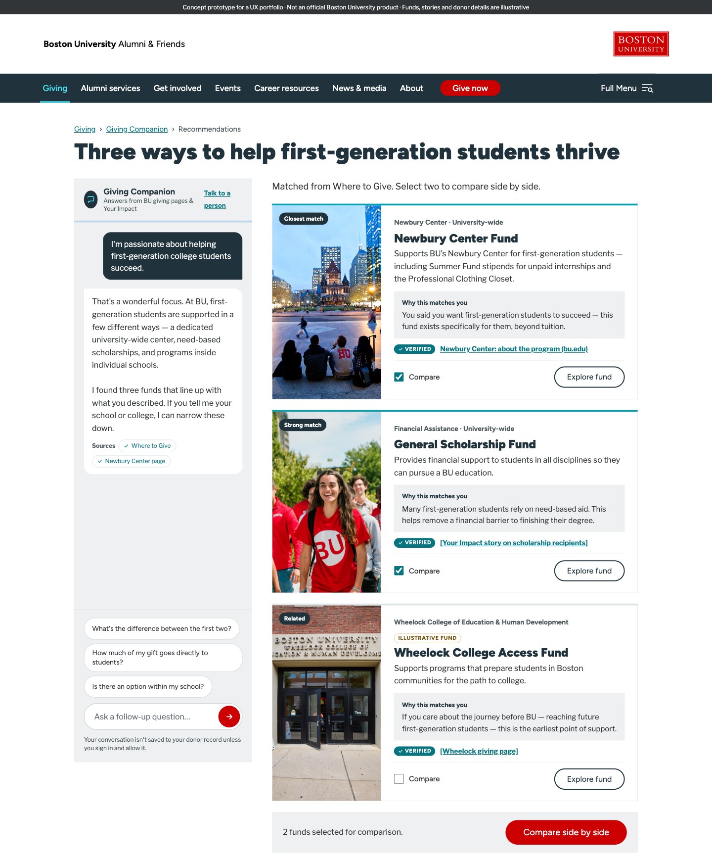
1 · Discover through conversation
Start with what the donor cares about, not with BU's org chart. A plain question, a few example prompts, and browse-by-cause for anyone who'd rather click than type. It lives inside the existing Giving navigation, and answers draw only from BU's published giving pages and impact stories.
2 · Explore recommendations you can question
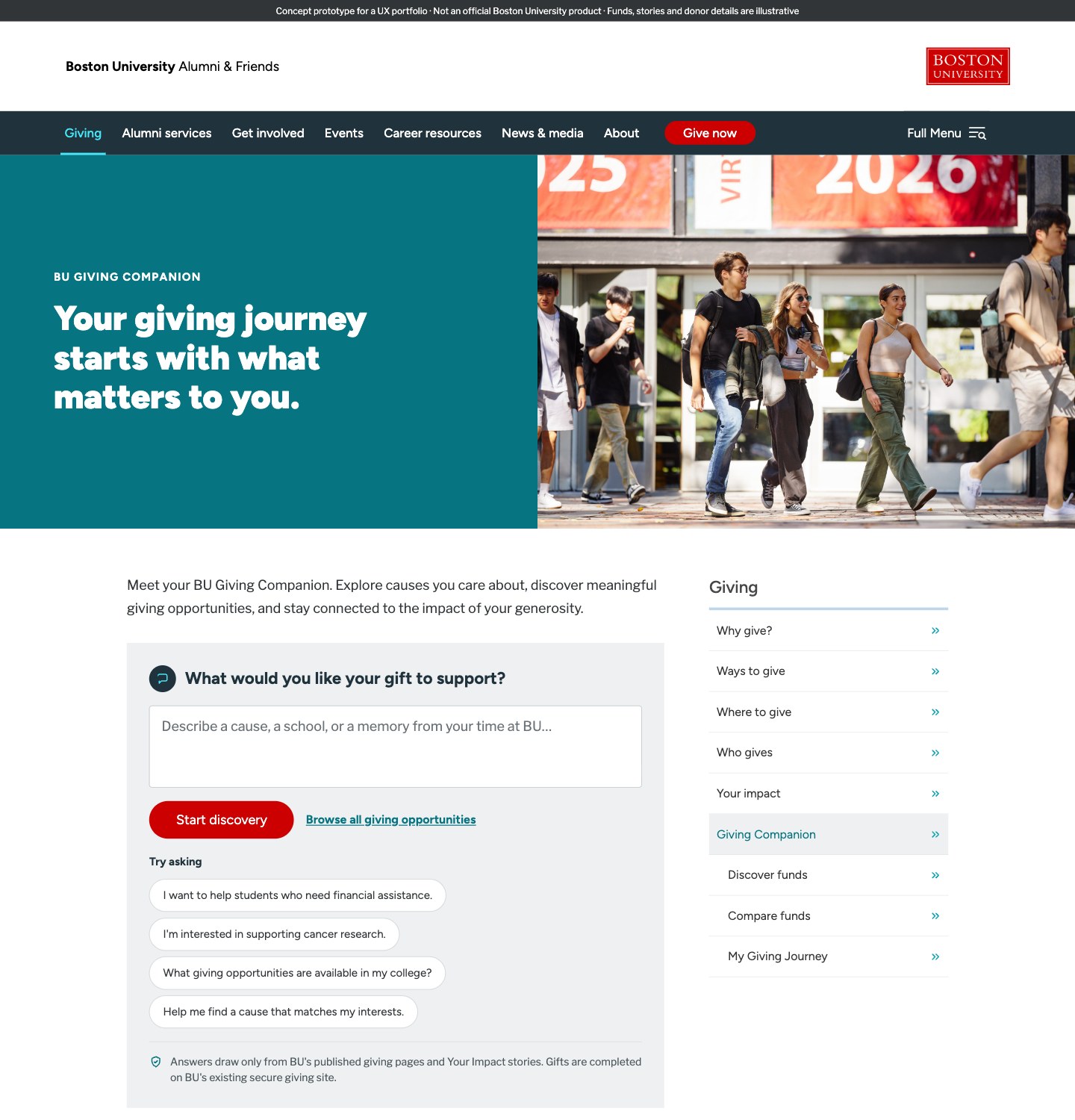
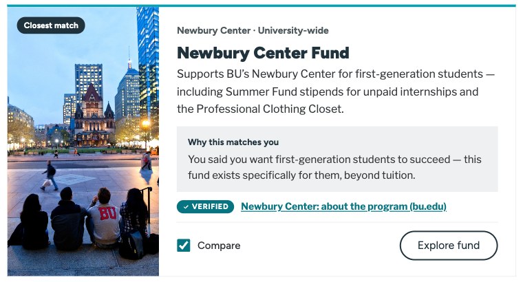
A donor writes, “I'm passionate about helping first-generation college students succeed.” The Companion answers in plain language, then shows three funds, each with why it matches and where that came from.
Graded, not ranked
“Closest match”, “Strong match”, “Related” say how strong the fit is without implying a score.
Reasons in the donor's words
“You said you want first-generation students to succeed…”
Room to narrow
Follow-ups like “Is there an option within my school?” keep the donor steering.
3 · Compare with confidence
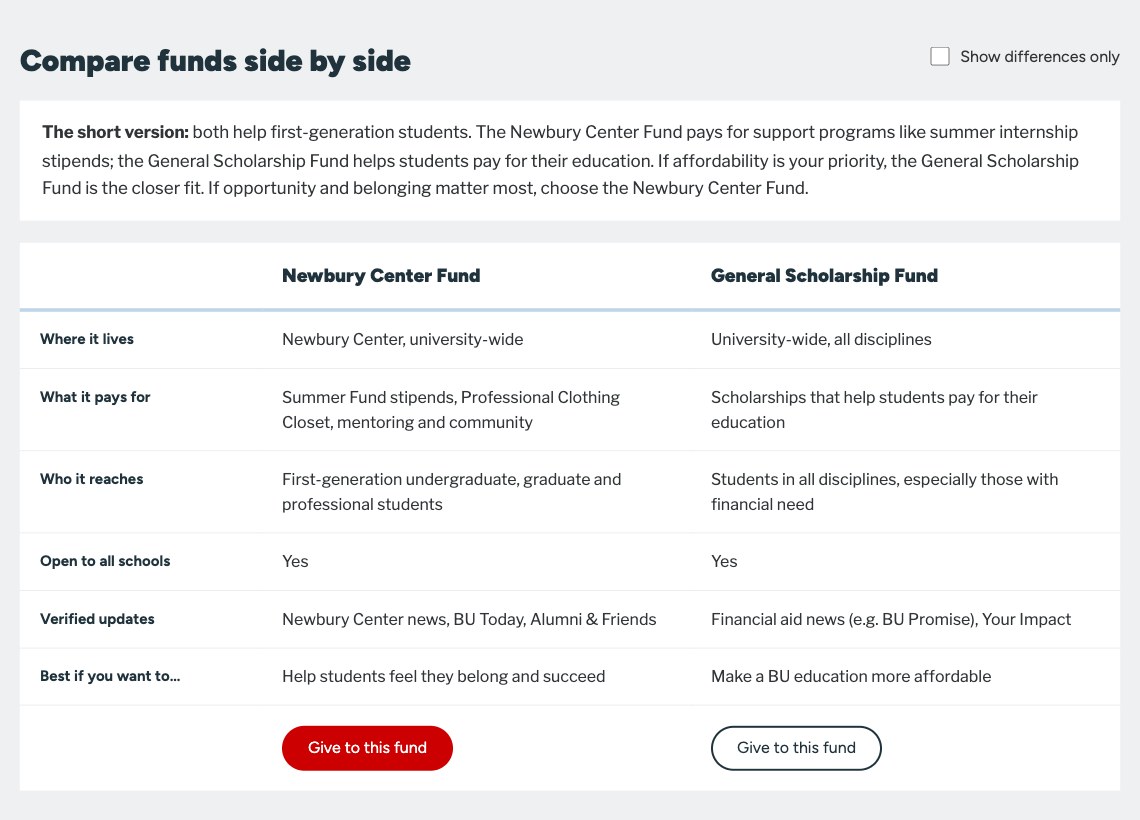
Two funds that both help first-generation students are easy to confuse. The comparison opens with a one-paragraph short version, then lines them up on the questions donors actually weigh. The last row, “Best if you want to…”, turns a spec sheet into a decision.
4 · Give through BU, not around it
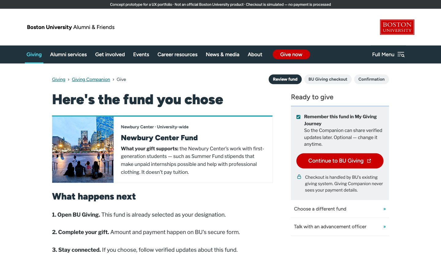
The Companion stops where payment starts. It confirms the fund, explains what happens next, and hands off to BU's existing secure giving form with the fund already selected.
5 · Beyond the donation
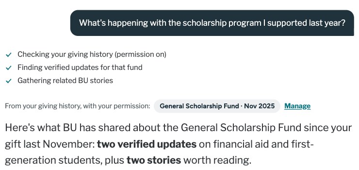
A year later the donor asks, “What's happening with the scholarship program I supported last year?” With permission to use their giving history, the Companion finds what BU has published about that fund since the gift.
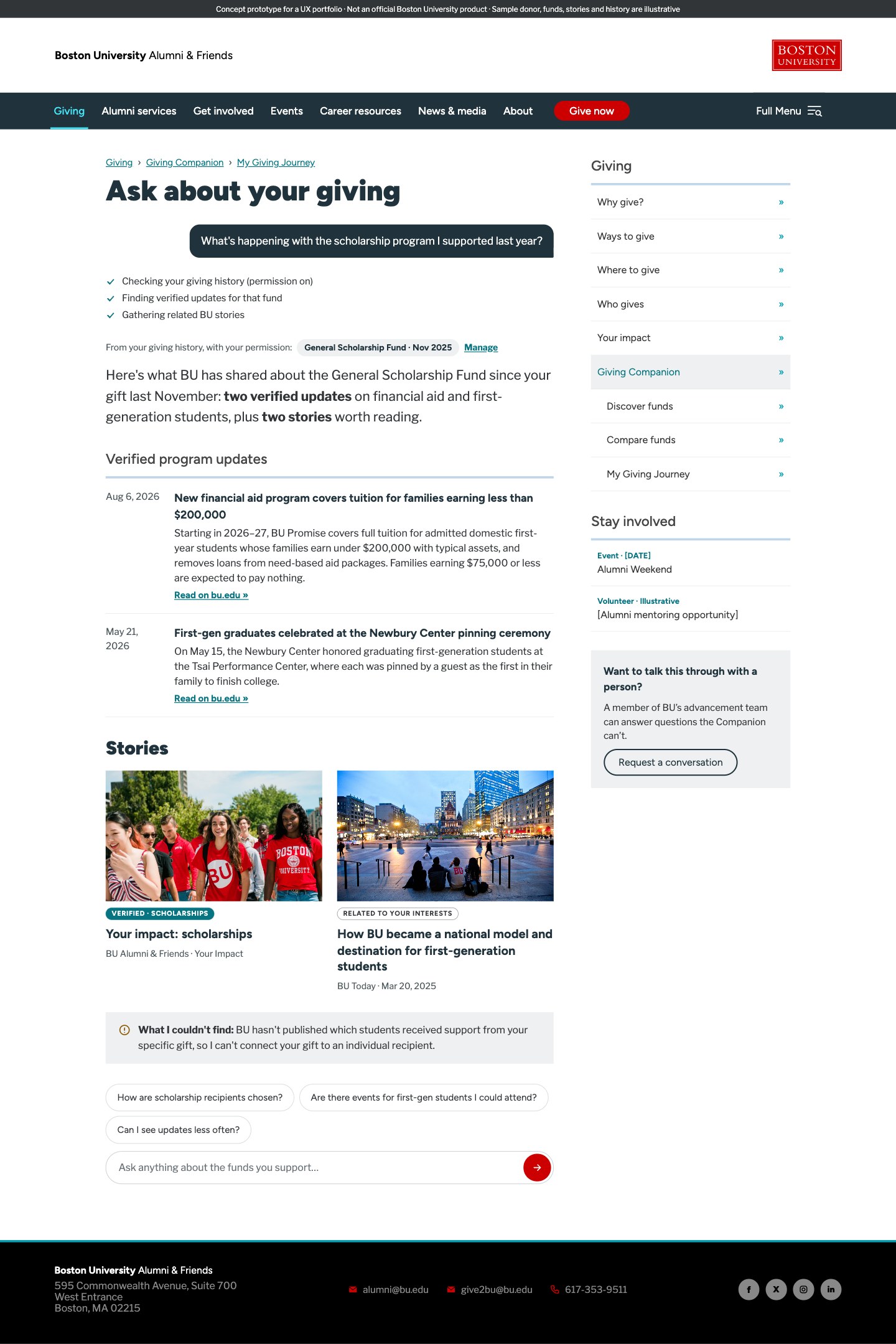
Program progress is not the same as your gift's impact.
The page reports what BU has published about the program and says plainly that it can't connect an individual gift to an individual recipient.
Trust by design
Six details that decide whether a donor believes it.
01
Recommendations explain themselves
Every fund says why it matched, in terms of what the donor said, and how strong the match is.
02
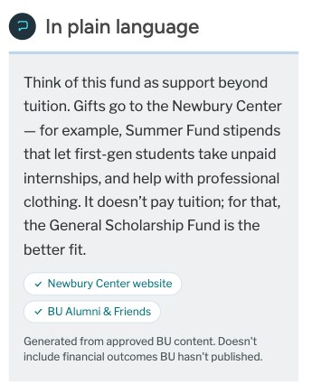
Sources you can check
Plain-language answers link back to the BU pages they came from and say what they don't cover.
03
Permission is visible and reversible
Giving history is used only when the donor allows it, and the page shows exactly what was used.
04
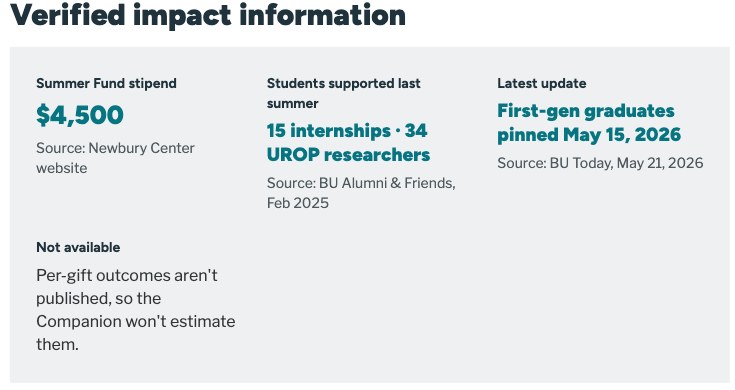
Honest about what it doesn't know
When BU hasn't published something, the Companion says so instead of estimating.
05
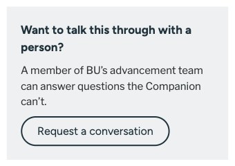
A person is always one step away
Talking to someone from advancement is offered on every screen, not hidden behind the assistant.
06
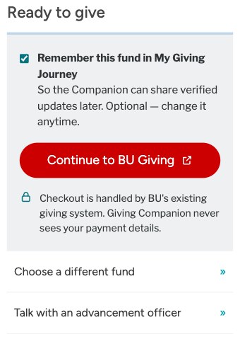
The donor decides, BU handles payment
Remembering the fund is opt-in, and checkout happens in BU's existing system. The Companion never sees payment details.
Validation and next steps
What this is, and what has to happen next.
- Done
- Interactive concept prototype
- Next
- Donor usability study
- Not done
- Donor testing, launch, results
Proposed donor tasks
| Task | What it would tell me |
|---|---|
| Find a fund that supports first-generation students. | Does conversational discovery reach a relevant fund? |
| Compare two funds. | Can donors explain the difference in their own words? |
| Verify where a recommendation came from. | Do donors notice and use source links? |
| Find updates about a program you supported. | Is My Giving Journey findable, and is it clear what isn't known? |
What I'd measure
- Relevant fund discovery success
- Accuracy of fund understanding
- Time and effort to compare options
- Recognition of verified evidence
- Trust and perceived usefulness
- Ability to find post-gift updates
I'd run the same tasks against a structured fund finder too. If it performs as well, it is the simpler product to ship.
Reflection
Connect, don't add
The opportunity wasn't to create more fundraising content. It was to explore how existing experiences could become more connected and meaningful.
The first test decides
The concept is only as good as its first test with real donors. That is the critical next step, alongside an honest comparison with simpler, non-AI alternatives.